accessibility-guidelines
This document is in beta. Help us by reporting issues via Github or email.
Text contrast
Make sure text has enough contrast.
Text must have a contrast ratio of at least 4.5:1 (or 3:1 in some cases) against its background colour.
On this page:
Requirements
- ‘Large scale’ text must have a contrast ratio of at least 3:1 against its background.
- Text that is not ‘large scale’ must a contrast ratio of at least 4.5:1 against its background.
- ‘Large scale’ text is text that is at least 24px, or 18.5px and bold.
Why?
- Good colour contrast assists people with vision impairment (including colour blindness) and cognitive impairments when viewing content.
- It also benefits all users in a brightly lit environment.
Guidance for Design
User tools like Sketch’s Stark plug-in, Colour Contrast Analyser to make sure that text has sufficient contrast.
More guidance for Design
- Colour contrast - why does it matter? on the Government Digital Service
Guidance for Quality Assurance
How to check whether two colour values have enough contrast
Use WebAIM’s Contrast Checker.
How to automatically check whether all the text currently shown on a web page has enough contrast
Use Deque Systems’ Axe extension for Firefox or Chrome, or Microsoft’s Accessibility Insights extension for Chrome.
How to manually check whether a piece of text on a web page has enough contrast
Follow these steps:
- Visit the web page using Firefox.
- Right click on the text that you want to inspect.
- Select 'Inspect element'.
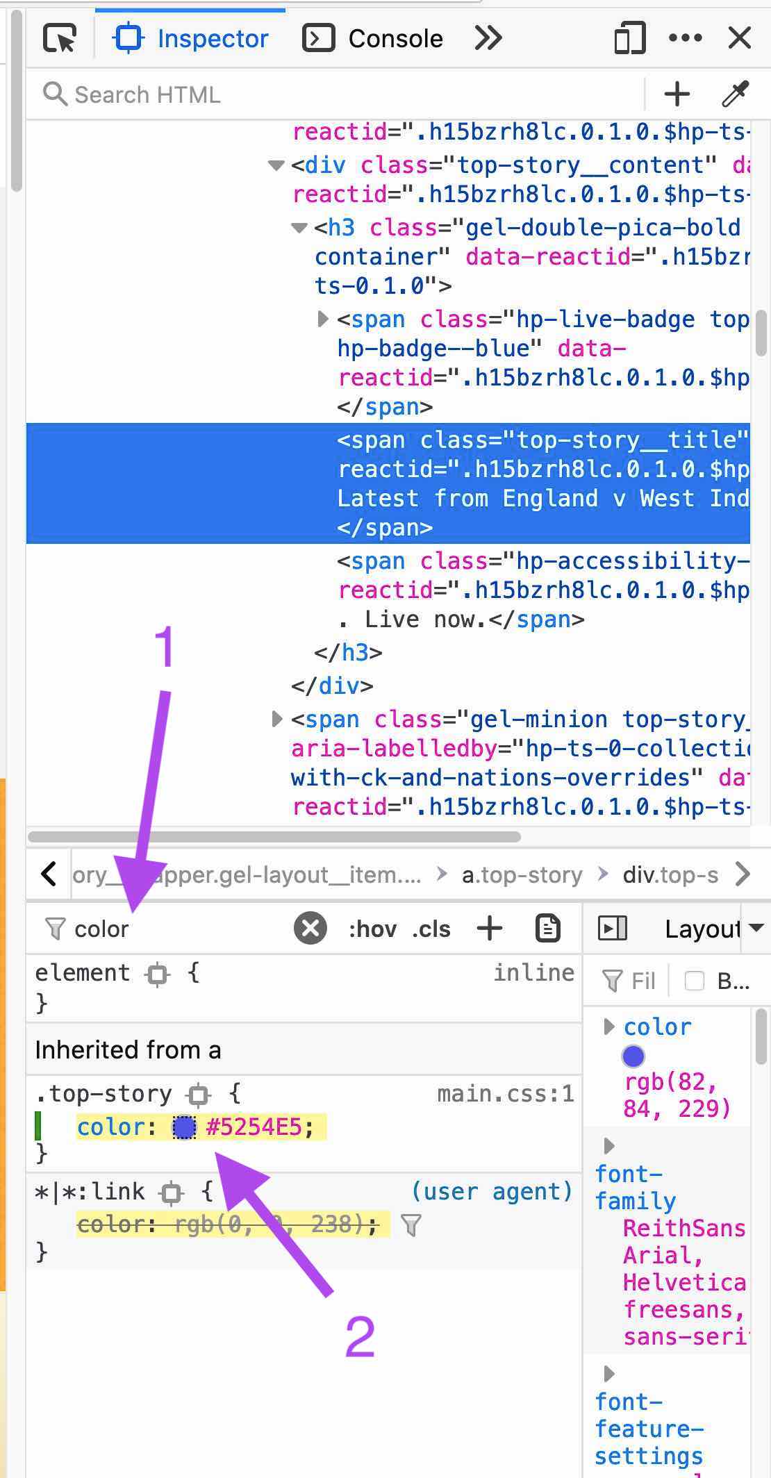
- A new panel should appear on the right side of the web browser window. At the bottom left of that window, you can see all the CSS style rules that apply to the text element you're inspecting.
-
At the top of that list of style rules, click on 'Filter styles' and type 'color'.

-
In the filtered list, find the CSS style rule called 'color'.
- If there are several, pick the one that's closest to the top of the list.
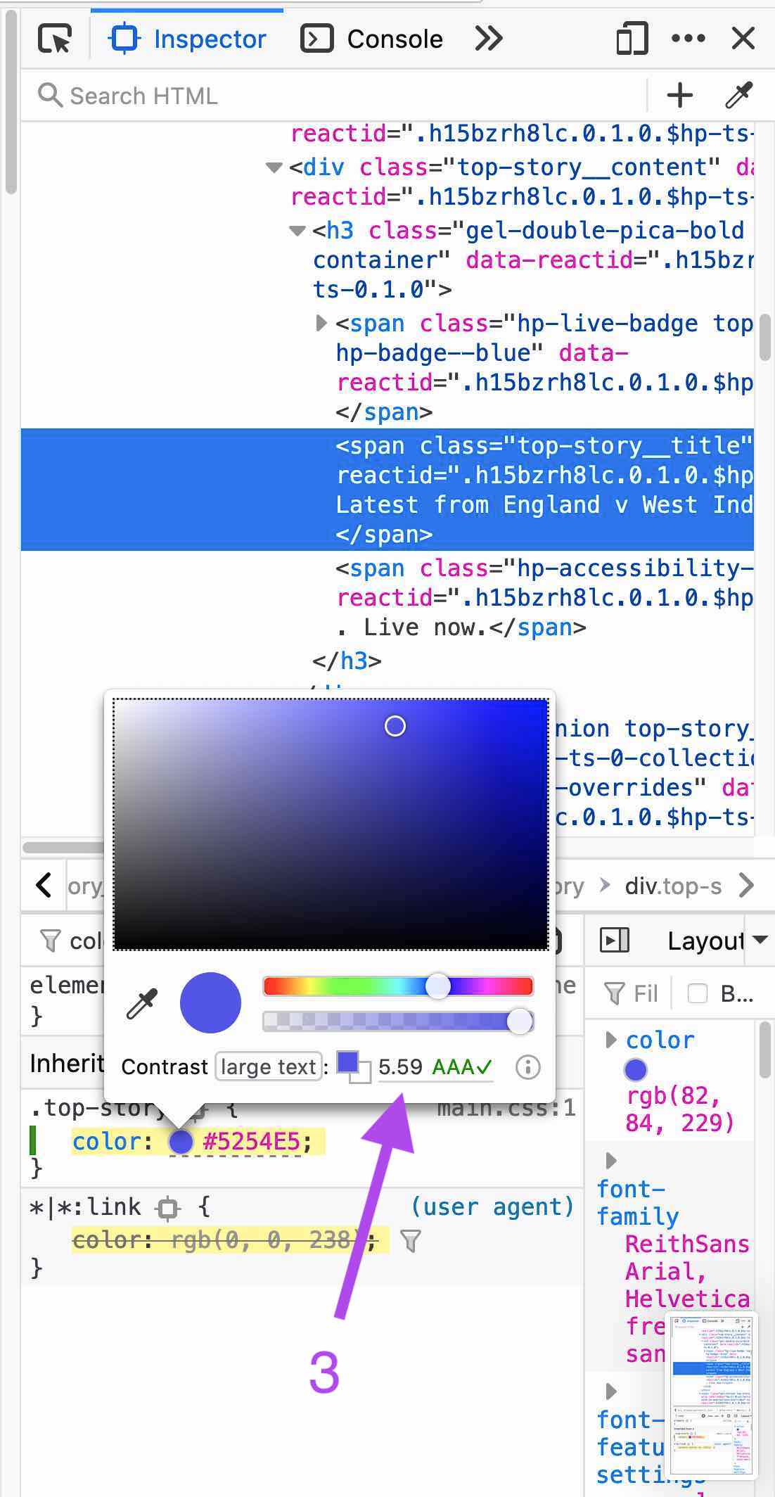
- Click on the small circle that shows a preview of the colour.
- At the bottom of the panel that opens, you should see something like: 'Contrast' followed by a contrast ratio number.
-
If the contrast ratio is high enough given the size of the text, you'll also see 'AA✓' or 'AAA✓'.

More info
Official wording in the Web Content Accessibility Guidelines
1.4.3 Contrast (Minimum): The visual presentation of text and images of text has a contrast ratio of at least 4.5:1, except for the following: (Level AA)
- Large Text: Large-scale text and images of large-scale text have a contrast ratio of at least 3:1;
- Incidental: Text or images of text that are part of an inactive user interface component, that are pure decoration, that are not visible to anyone, or that are part of a picture that contains significant other visual content, have no contrast requirement.
- Logotypes: Text that is part of a logo or brand name has no minimum contrast requirement.
See the W3C’s detailed explanation of this guideline with techniques and examples.
Note: In the guidelines, ‘Large-scale text’ is defined using CSS pt as a unit. But 1 CSS pt is 1.33333 CSS px (both units represent absolute lengths, not linked to the size of a physical pixel on a particular device). So 18pt = 24px.
Sources
- W3C Web Content Accessibility Guidelines 2.1
- Government Digital Service WCAG 2.1 Primer
- The BBC’s Mobile Accessibility Guidelines
Contribute
This document is in beta. Help us by reporting issues via Github or email.