accessibility-guidelines
This document is in beta. Help us by reporting issues via Github or email.
Reflow (also known as ‘Responsive Web Design’)
People can access the page’s content and functionality without needing to scroll horizontally:
- at 100% zoom in a window that’s 320px wide,
- zoomed up to 400% in a window that’s 1280px wide.
On this page:
Requirements
-
There should be no loss of information or functionality, and users should not need to scroll content both vertically and horizontally, when:
- they’re viewing the page on a 320px-wide screen with the default zoom level (100%),
- they’re viewing the page in a 1280px-wide browser window at any zoom level up to 400%.
Success example: Kooth’s landing page
Why?
- Needing to scroll in the direction of reading in order to reveal lines that are cut off makes reading difficult.
- If content is hidden off screen in both the vertical and horizontal directly, it’s more likely people will miss it.
How does this work?
1 CSS pixel is defined as 1/92th of an inch at 100% zoom. (Note: A CSS pixel is an absolute, fixed length unit. It’s not related to the size of a physical pixel).
Increasing the browser’s zoom level changes the size of 1 CSS pixel. For example, at 400% zoom, 1 CSS pixel is 1/23th of an inch, rather than 1/92th.
Common mistakes
Common mistake #1: Content does not reflow to a single column when zoomed.
Common mistake #2: Scrolling bars appears both horizontally and vertically when using browser zoom.
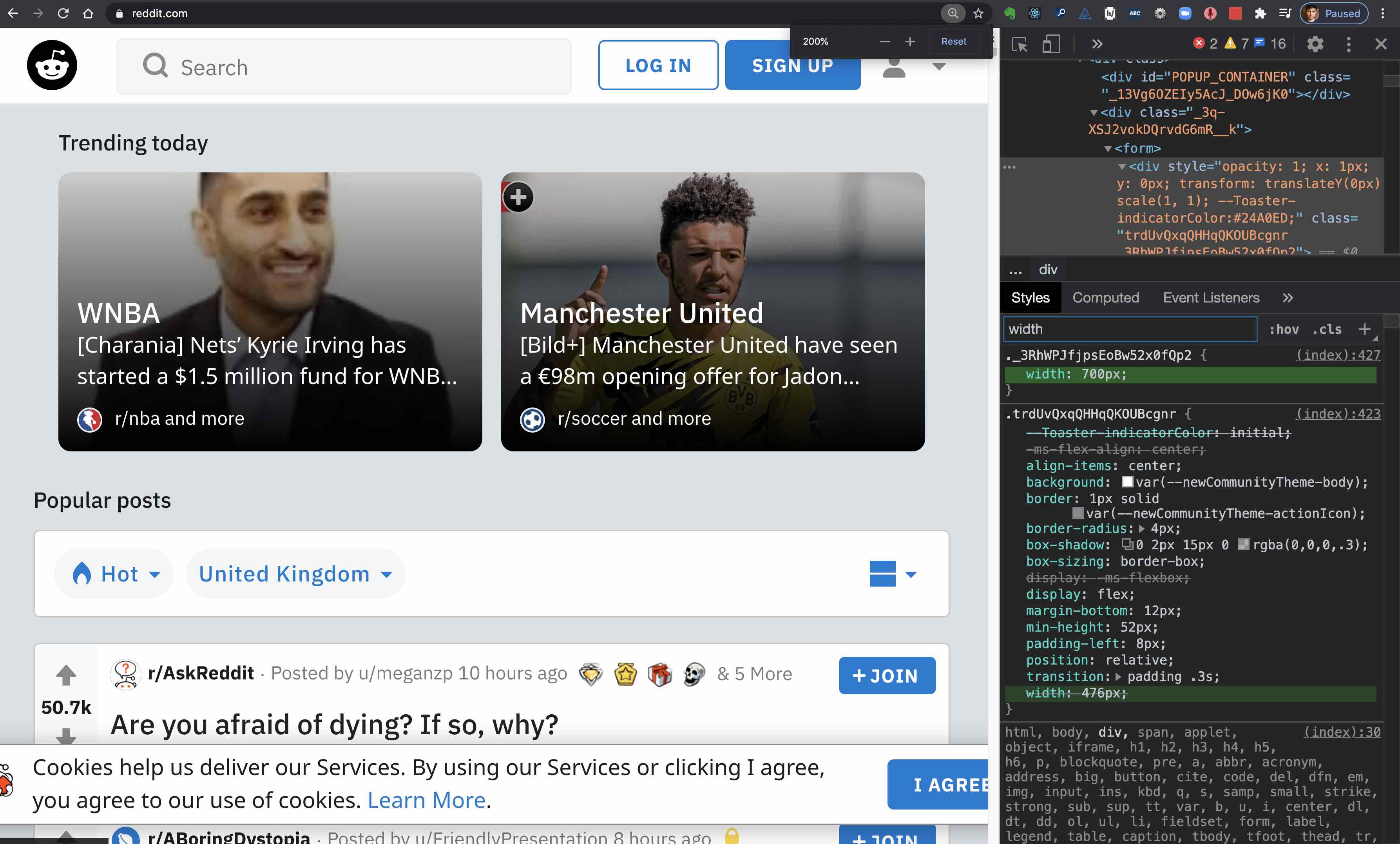
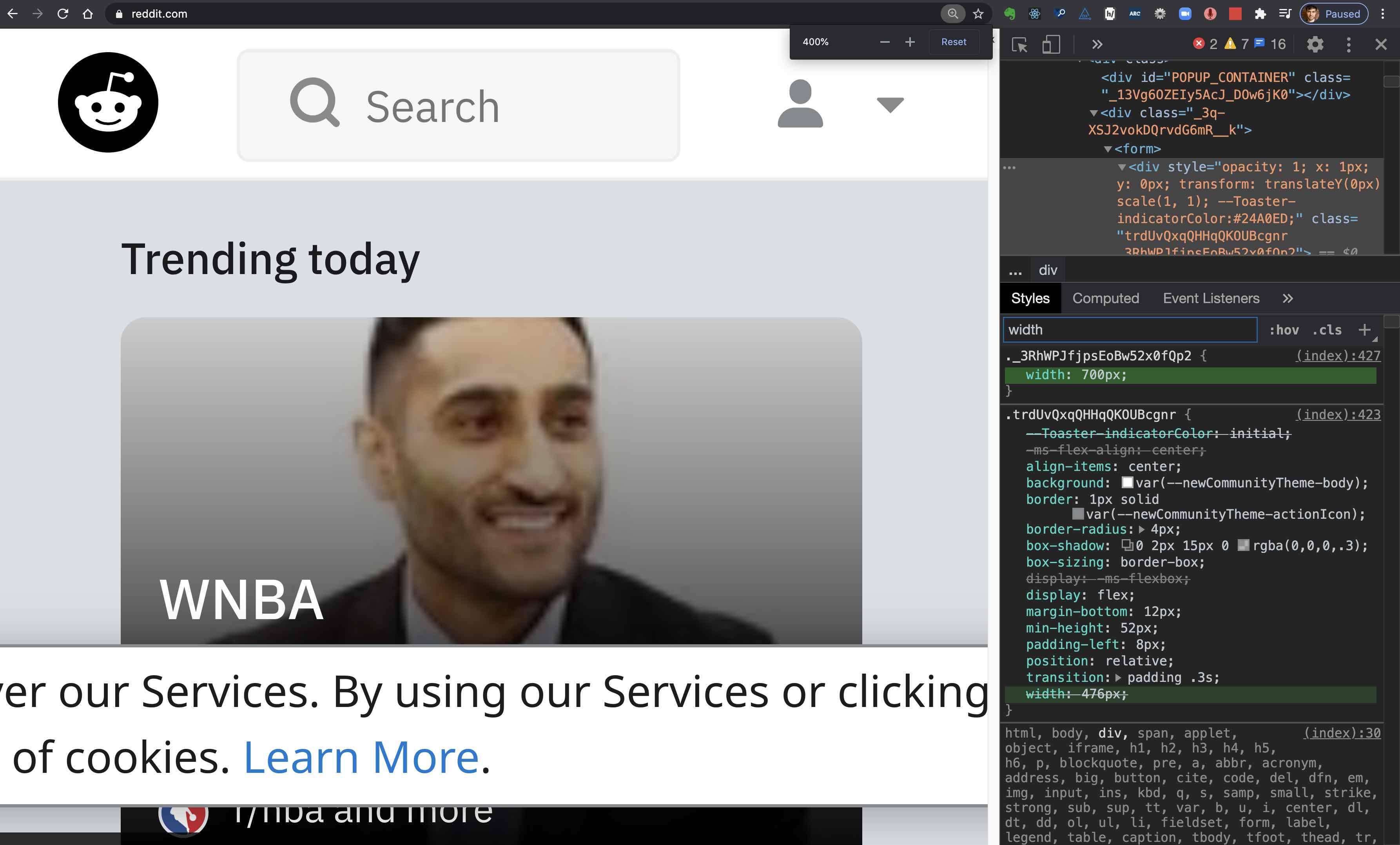
Common mistake #3: Giving an element a fixed width that’s larger than 320px
If you give an element a fixed width that’s larger than 320px:
- it won’t fit on a 320px-wide screen,
- it won’t fit within a 1280px-wide window at 400% zoom.
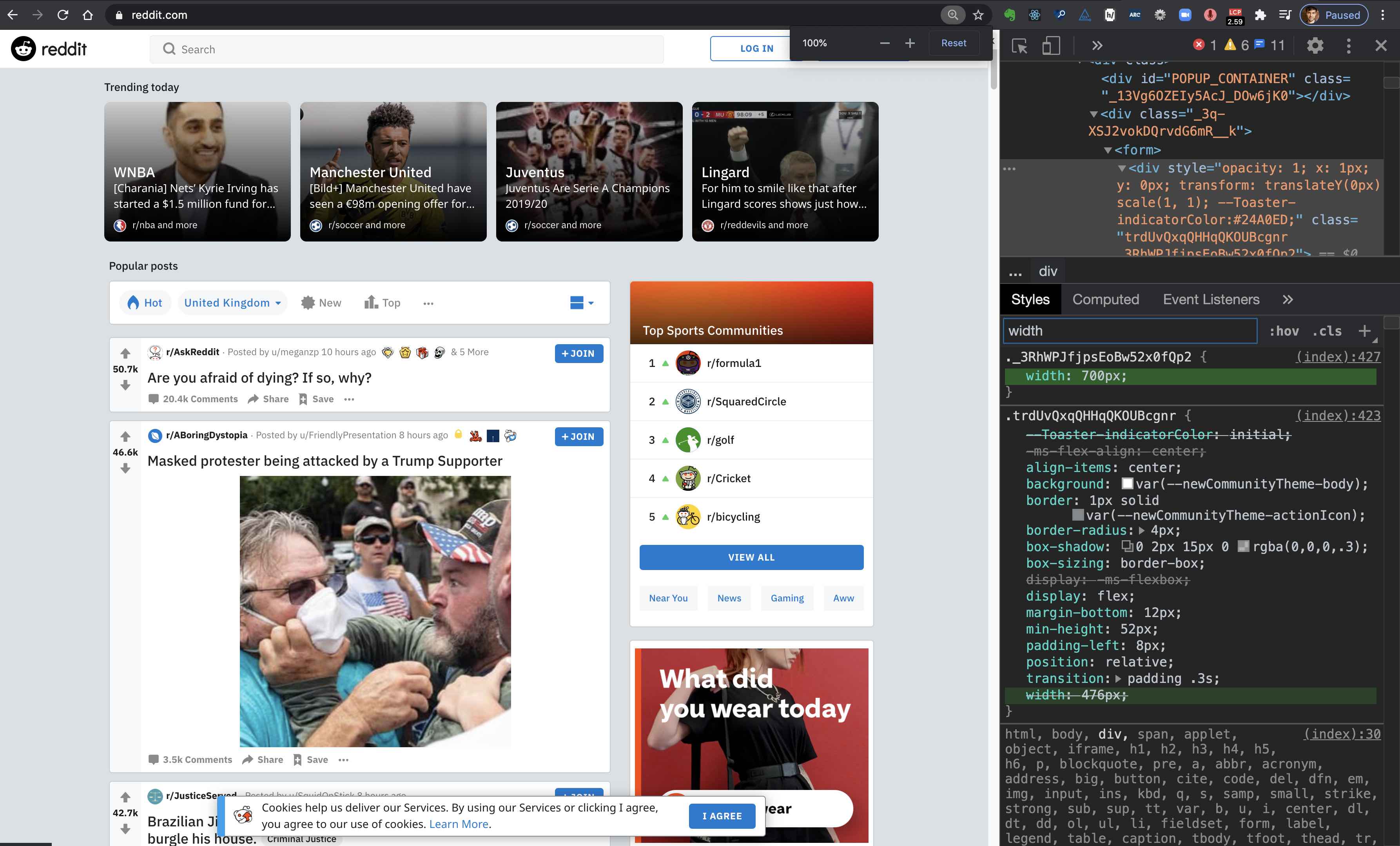
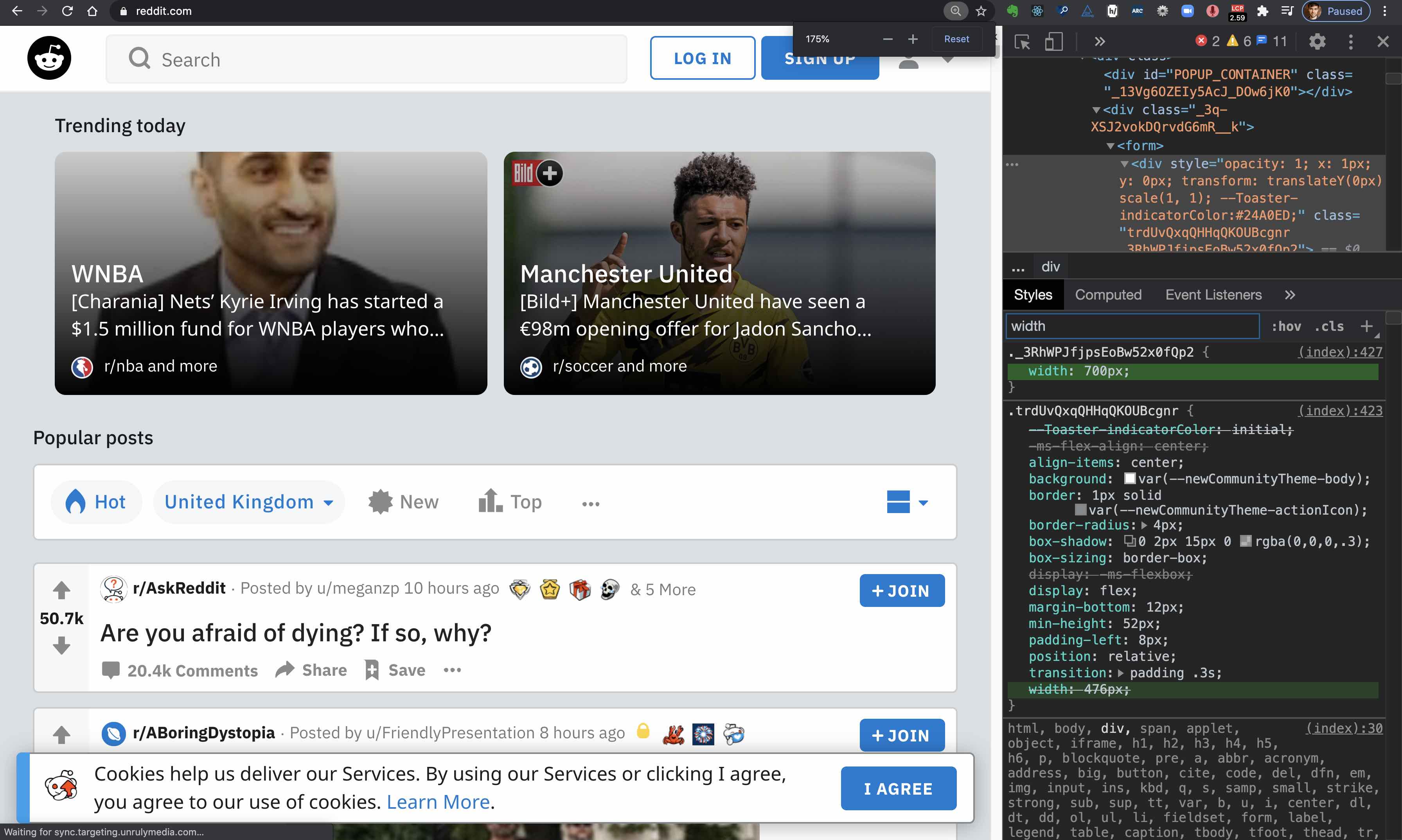
Failure example: Reddit ‘cookies policy’ dialog
The example shown in a video:
The same example shown in pictures:
On a 1280px-wide window at the default (100%) zoom level, the whole banner fits on screen:
Guidance for Code
This is about using Responsive Web Design techniques, such as:
- Media queries;
- Flexbox / CSS grid to let elements change their width or reflow onto several lines based on the width of the viewport;
- Giving containers a width that’s relative to the width of the viewport (using
%orvhfor example).containers and letting content reflow when it can’t fit horizontally within the viewport.
Displaying code
The use of <code><pre> formatted content (such as code) can cause horizontal scrolling. Using the CSS declarations such as word-wrap: break-word; on <code><pre> in small viewports will help to avoid horizontal scrolling at all.
More guidance for code
See the W3C’s detailed explanation of this guideline with techniques and examples.
Guidance for Design
- Design ‘Mobile first’: design the layout for narrow screens first.
- This forces you to decide how all of the page’s elements fit in one column.
- Make sure that your layout works on a 320px screen (like an iPhone 5, or the original iPhone SE), not just on a wider mobile device.
- This same layout is what users will see …
- On a 640px screen when the browser’s zoom is set to 200%
- On a 1280px screen when the browser’s zoom is set to 400%
- This same layout is what users will see …
Guidance for Quality Insurance
1. Checking at 100% zoom in a 320px wide window
- Visit the page using Google Chrome
- Make sure that your zoom level is 100%. You can use Ctrl +/- on Windows and Cmd +/- on macOS to change the zoom level.
- Open the developer tools by right clicking anywhere on the page and selecting 'Inspect element'
-
Make the developer tool window bigger, so that the web page window is just 320px wide.
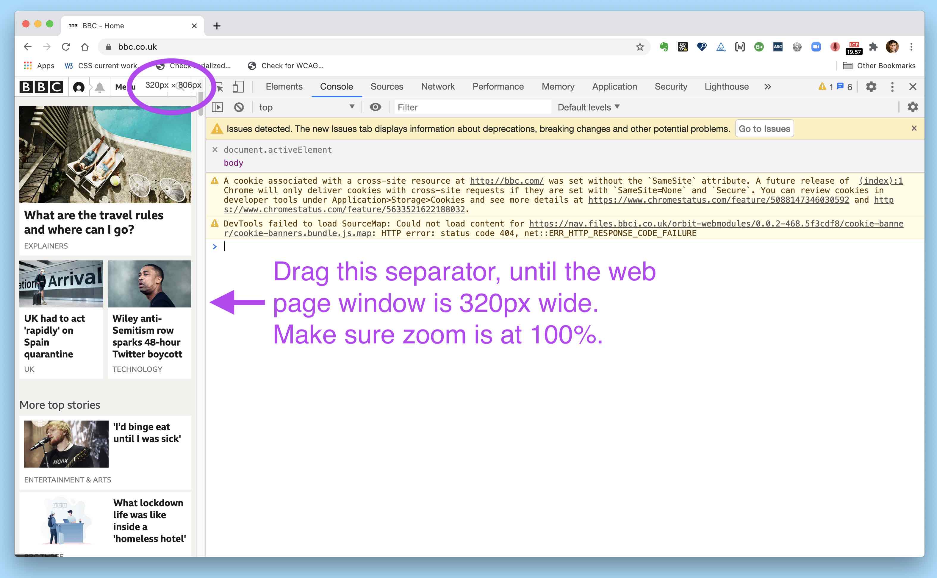
- Assuming that the developer tool window is on the right hand side of the web page content:
- Place your mouse on the separation between the web page and the developer tool window. (If your mouse cursor is in the right place, it will show left and right arrows).
- While you resize the developer tool window, you should see the dimensions of the web page window update, on the top right corner of the web page window.
- Check that you can see all of the web page's content without needing to scroll left and right.
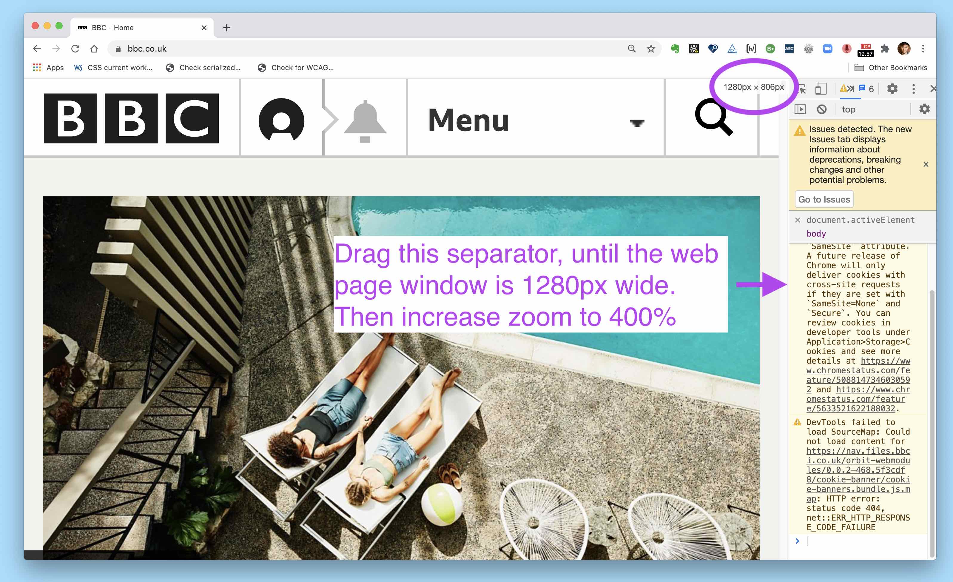
2. Checking at 400% zoom level in a 1280px wide window
Follow the same steps as above, but this time:
- Resize the developer tool window so that the web page window is 1280px wide.
- Increase the web page's zoom level to 400%.
If your screen is not wide enough to do that, you can do this instead:
- Resize the developer tool window so that the web page window is 640px wide.
- Increase the web page's zoom level to 200%.
More info
Official wording in the Web Content Accessibility Guidelines
1.4.10 Reflow (Level AA): Content can be presented without loss of information or functionality, and without requiring scrolling in two dimensions for:
- Vertical scrolling content at a width equivalent to 320 CSS pixels;
- Horizontal scrolling content at a height equivalent to 256 CSS pixels.
Except for parts of the content which require two-dimensional layout for usage or meaning.
Note: 320 CSS pixels is equivalent to a starting viewport width of 1280 CSS pixels wide at 400% zoom. For web content which is designed to scroll horizontally (e.g., with vertical text), 256 CSS pixels is equivalent to a starting viewport height of 1024 CSS pixels at 400% zoom.
Examples of content which requires two-dimensional layout are images, maps, diagrams, video, games, presentations, data tables, and interfaces where it is necessary to keep toolbars in view while manipulating content.
See the W3C’s detailed explanation of this guideline with techniques and examples.
Sources
Contribute
This document is in beta. Help us by reporting issues via Github or email.