accessibility-guidelines
This document is in beta. Help us by reporting issues via Github or email.
Use of colour
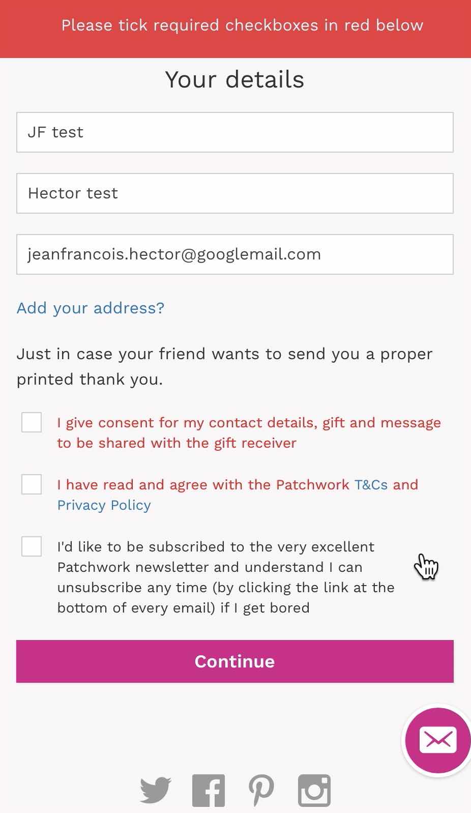
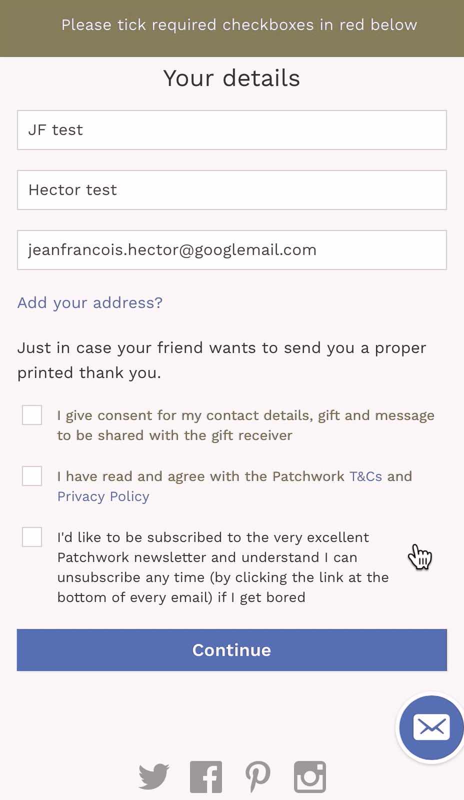
Does the page use colour to convey information?
→ Also communicate that information in a way that doesn’t assume people can distinguish colours.
Do not use colour as the only way to convey any piece of information.
For example, don’t use colour alone to:
- identify form fields with invalid entries;
- distinguish between lines on a graph;
- identify the current step in a step indicator;
- distinguish between areas of a map.
On this page:
Requirements
General requirement
- Colour alone must not used as the only way to communicate a piece of information. Additional visual cues must be used used to provide the same information (like icons, shapes, patterns, text, …).
How this applies to infographics
- Information graphics and charts that use colour as a key also provide distinctive non-colour differences (like hatching patterns or directly applied labels).
How this applies to links in a paragraph of text
-
Links in a paragraph of text must not be indicated by colour alone. They must be indicated by another visual indicator as well (like an underline or an icon).
- Ideally that other visual indicator is present all the time, not just when users hover the link with their mouse. (Because touchscreen users don’t use a mouse).
-
If that’s not possible, this is less usable and accessible but still meets the guidelines:
- Make sure the contrast ratio between the colour of the link and the colour of the surrounding text is at least 3:1;
- And add another visual indicator (for example an underline) when they are hovered by the mouse and receive keyboard focus.
- If you use underlines to communicate the presence of links, make sure that no other text on the page is underlined.
Why?
- This ensures that people who are unable to see colours, or who have difficulty telling different colours apart, understand the content and user interface.
- Colours can be difficult to distinguish in bright sunlight.
- Screen readers do not detect colour.
- Some users will change colour settings for their whole computer, such as applying a tint to help with reading.
Common mistakes
- Using colour alone to indicate that the user forgot to fill in a text input, or tick a box.
-
Using colour alone to indicate that the user didn’t fill in text input correctly.
- A form uses only colour to indicate a required field.
- Colour-coding text or backgrounds to indicate essential content, pass/fail categorisation, etc.
- Links are only distinguished from plain text by colour and the colour may not vary from the main body text.
- Text alternatives that do not include information conveyed by colour differences in the original image.
Guidance for Design
Colour is often used to show:
- a tab is selected,
- a link is available,
- text is an error message,
- emphasis,
- charts and graphics, or
- other meaningful information.
Additional visual and non-visual methods of identifying information or meaning must be applied to complement the use of colour:
- Visual cues could be:
- text complementing colours;
- text styles (such as underline, bold or italic);
- patterns (in graphs or infographics, for example);
- icons with suitable alternative text;
- border-with changes (to identify that a text input field is in focus, for example);
- …
- Non-visual cues, which are programmatically available to assistive technologies, could be:
- visually hidden text;
- HTML element tags (such as
aria-disabledfor the Web); - suitable ‘Accessible Names’ for elements;
- …
How to style links
- It’s best for all links within blocks of text to be underlined, and no other content on the page to be underlined.
- If links cannot be underlined and are identified via colour alone, the contrast ratio between their colour and the colour of the surrounding text is at least 3:1, and their visual appearance changes (e.g. they become underlined) when they receive the mouse hover and keyboard focus.
- Note that this method doesn’t help users using touch screen devices
- Links in a navigation menu do not need underlining, as their presence of a navigation menu makes it obvious that they’re links.
More guidance for Design
- Understanding Colour Blindness
- Inclusive Design Tips: Presenting Information in Multiple Ways by Deque
- Sim Daltonism app on the macOS App Store
Guidance for Code
More info
Official wording in the Web Content Accessibility Guidelines
1.4.1 Use of Color: Color is not used as the only visual means of conveying information, indicating an action, prompting a response, or distinguishing a visual element. (Level A)
See the W3C’s detailed explanation of this guideline with techniques and examples.
Sources
- W3C Web Content Accessibility Guidelines 2.1
- Government Digital Service WCAG 2.1 Primer
- Barclays’ Accessibility Design Standards
- The BBC’s Mobile Accessibility Guidelines
Contribute
This document is in beta. Help us by reporting issues via Github or email.